CarbCutter webapp design project
Design project to create an MVP webapp prototype to help its users monitor their carbohydrate and calorie intake.
Skills used:
- Competitor Analysis | SWOT Analysis
- Business Requirements
- User Interviews
- Card Sorting | Affinity Mapping
- User Personas | User Stories
- Sitemap | Taskflows
- Wireframing | Prototyping (low-high fidelity)
- Usability Testing | Preference Testing
- Design Styleguide | Design Systems
Tools used:
- Figma
- Adobe Creative Suite
- Balsamiq
- Miro
My roles:
- UX Design
- UX Research
- UI Design
- Visual Design
User-centered design process
Understand & Empathize
Prototype & Test
Iterate
Understand and Empathize
Competitive Analysis
In order to understand what solutions already are available to the users as well as where the opportunities for improvement lie, I performed a competitive analysis of two top contenders for the keto audience: Carb Manager and MyFitnessPal.
The two competitors were analyzed by:
- Marketing profile (how they present themselves on the market)
- Overall strategy (the business strategy and positioning relative to the competitors)
- SWOT analysis
- UX analysis

What were the findings?
- The biggest value lies in the inclusive food database
- The more metrics there are to track the more confusing the interface. Long dropdown menus result in basic functions being hidden.
- While it is easy to preview the daily progress - it is confusing to see how much is left to consume and how that translates to what can actually be eaten.
User Interviews
Being a user myself, I ran the risk of unconscious bias in my search for solutions. Therefore, I needed to uncover the truth (or as much of it as possible) about the actual user behaviors by asking open ended questions and thoroughly recording all the answers. All the gathered data and insights were analyzed and organized using affinity mapping.
I needed the interviews to help me:
- Understand more about others’ behaviors and contexts around keto diet,
- Pinpoint the main tasks that users wanted to complete and their prioritization,
- Uncover pain points while performing these tasks,
- Gain insights into community behaviors and other potential latent needs of the users.

Participants:
- 4 people were interviewed,
- All participants have been on keto diet for at least 6 months in the past,
- Ages: 25-40,
- Motivations: varied,
- All participants have had experience with calorie tracking apps.
What I learned from the interviews:
- People start keto diet mainly for weight loss reasons,
- Users clearly separate the food logging from exercise logging. They are more prone to focus on food logging and find exercise logging imprecise,
- An app or online calculator is indispensable in the keto diet process. Logging usually takes place after the meal or at the end of the day,
- None of the users tried more than 1 app. Once they downloaded an app, they found a way to make it work for them!
- Once logging - precision is of utmost importance,
- Users like to set up meals/recipes/frequent foods to speed up logging - they tend to eat similar food often,
- They do not report need for community interaction,
- Strong need for expert input.
Define
User Personas
Based on the interview and common user goals and tasks, I identified 3 key personas to help maintain focus on the user throughout the design process.
For the sake of this project I decided to focus on one of them - Kate.


Kate's User Journey
Bearing Kate in mind, I identified the key tasks that need to be completed together with accompanying emotional states for each step of the user journey.

Kate's User Flow
Based on the goals that Kate needs to achieve, which are the key tasks for the app, I mapped out the relevant user flows for:
- Sign up,
- Account setup,
- Food logging,
- Meal saving.
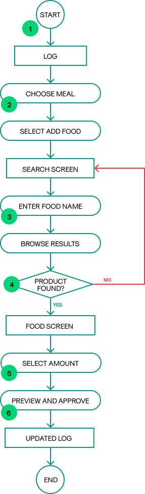
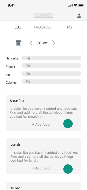
Logging and tracking macros is the main objective of all users of the app - which is why I wanted to focus this particular workflow:
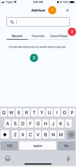
Logging in food
Entry point: App dashboard
Success criteria: Food is added to the Log
Task flow
- User starts at the dashboard level
- User chooses which meal they want to add food for
- Inputs food name and searches in the results
- Chooses the relevant product from the list
- Inputs the amount
- Previews and adds the entry to the log
Prototype & test
Design evolution
Mapping out the key workflows helped me focus on the main app functionalities during the early stages of prototyping.
Starting with paper sketches for “quick and dirty” visualisation of the information architecture and general UI helped me kick off the iterative process of designing my wireframes.
After creating a mid-fidelity prototype in Figma, it was time to put the design of the core functions to the test.
Usability testing on the mid-fidelity prototype allowed me to poinpoint areas for improvement and further iterate on the wireframes.
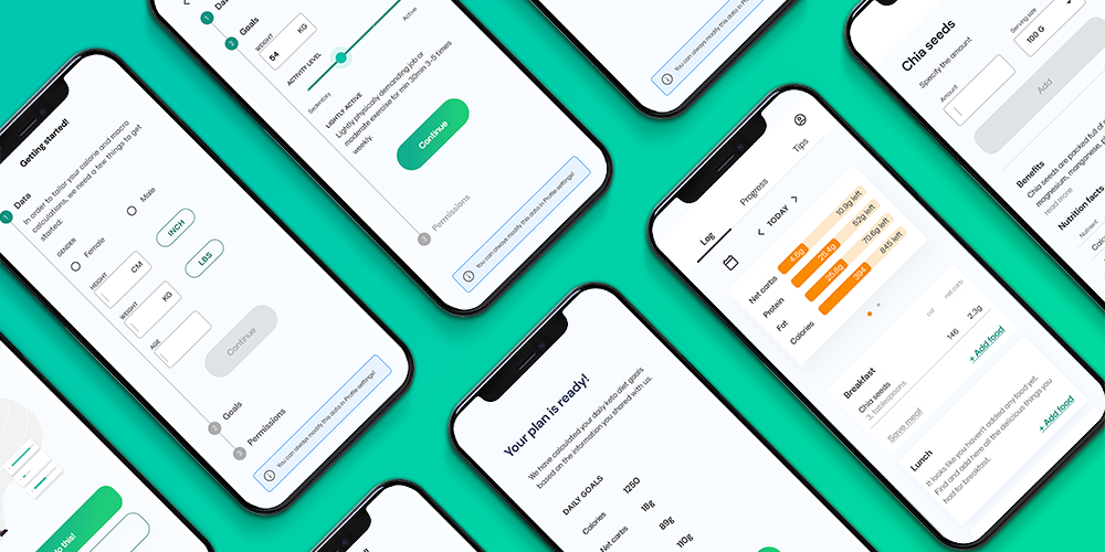
This is the design evolution for each of the key screens in Kate’s user flows:
Sign up
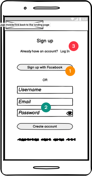
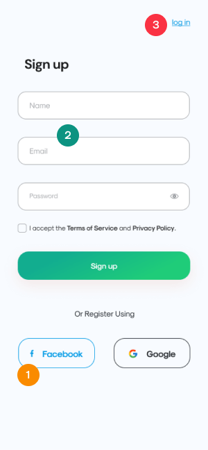
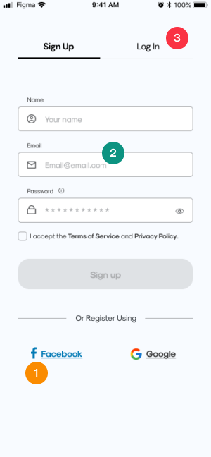
- Sign up using Facebook was deprioritized due to business considerations - we would prefer the user to use their email address for the signup.
- Based on accessibility considerations - labels, icons and placeholder text were introduced; Password instructions were included prior to the input form and not in form of a placeholder. Colors were adjusted for the optimum contrast.
- Based on feedback - Log In option was modified for better discoverability and design consistency.
Account setup
The account setup screen underwent considerable changes based on usability testing:
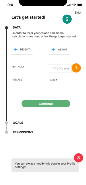
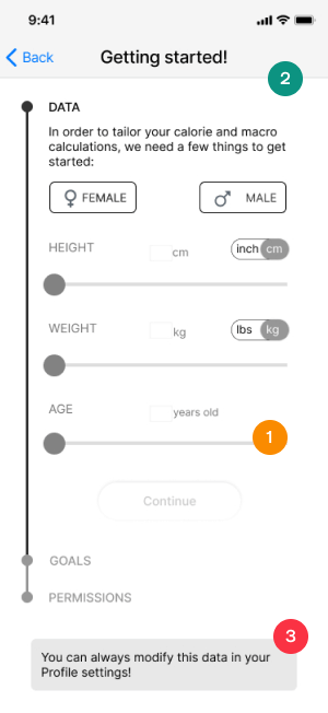
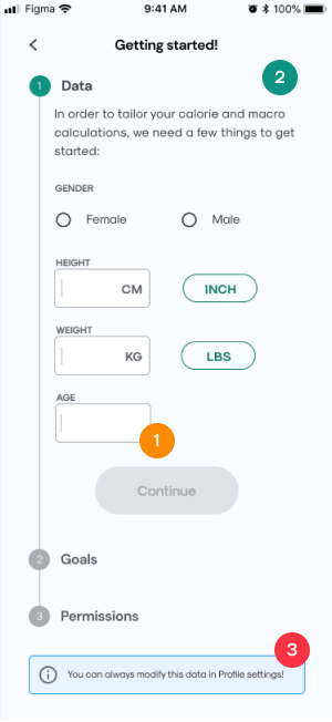
- Sliders were dropped in favor of input forms which are more understandable and precise, unit toggles were changed into chips for greater simplicity
- I have further changed the layout to make it less spread out and cleaner. Based on accessibility considerations - input form containers were introduced and colors were adjusted for the optimum contrast.
- Alert/info box was optimised to look less like a button.
Dashboard
The core of the dashboard remained the same throughout the iterations - with some exceptions:
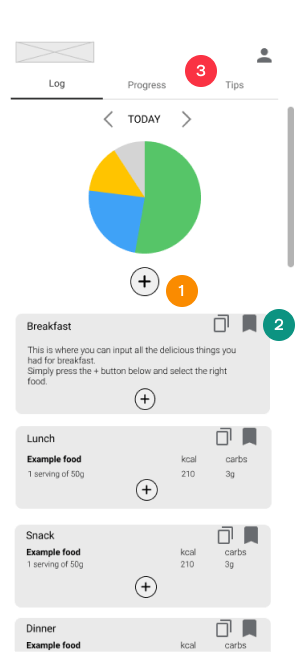
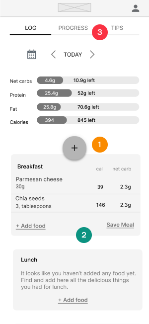
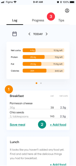
- The floating + button was dropped based on user testing as well as preference testing.
- ‘Add food’ as well as ‘save food’ functions in each meal card were made into link buttons with descriptive microcopy - instead of being hidden in the menu or as icons.
- Based on peer review, the Tab menu was adjusted to include white fill - to separate it visually from the rest of the content.
Search food
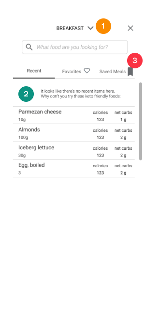

- Because the + button was scrapped, there was no need to edit the type of meal (e.g. breakfast, lunch etc.) in the ‘Add food’ screen. This functionality was dropped for the sake of simplicity.
- Empty states filled with the placeholder recommendation foods could be confused for actual content - therefore, this idea was dropped as well.
- Tab menu was modified to be consistent with other UI elements.
Food screen
The functionalities remained the same but the interface has been changed considerably:
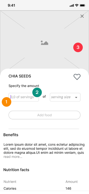
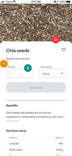
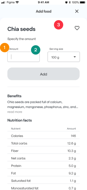
- Labels were introduced to the input forms, instead of conveying this information as empty states.
- Placeholder content was dropped so that it would not be confused with the actual content, but default value for ‘serving size’ was kept due to confusion that ‘serving size’ terms caused during usability testing.
- Image was dropped due to concerns about the content creation process (really troublesome to upload images for most foods there are) as well as due to loading time concerns.
Usability testing
At the mid-fidelity stage it was neccessary to conduct a usability testing.
I wanted to understand if my design is developing in the right direction and needed aswers to questions that arose in the ideation stage.
Each of the 6 participants was given 3 tasks to accomplish using the webapp prototype.
What I needed to know
- Do the users understand the purpose and value of the app?
- Do they understand the concept of Log in the context of the app?
- How do the users search for food items in the app
- Are all dashboard elements understandable/useful /finadable to the users? Is anything missing?
- Do they find all the functionalities useful so far?
- What errors do they make while doing the tasks and how do they recover from them?
The scenarios and tasks were as follows:
- You are starting a low carb diet but you are not sure how much of what you should each day to lose weight. Use the app to calculate how many calories and carbs you can consume on a daily basis.
- You have just eaten 3 tablespoons of chia seeds and 3 slices of parmesan for breakfast. You would like to see how much carbohydrates you have consumed and how much is left for you to eat that day. Use CarbCutter app to find the right foods and record what you have eaten.
- You realized that you eat the same breakfast every day and would like to save time on inputting same information every day. Using the app, find a way to speed up the process of recording meals you eat on a regular basis.
Test results and analysis:
Having compiled the results of the testing sessions, I created affinity diagrams to organized the data and identify error patterns. I clustered similiar types of errors using a rainbow spreadsheet and then moved on to iterating on my design accordingly.
What I learned from usability testing:
Save meal screen
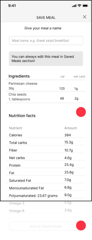
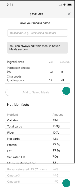
Pain point:
The users were looking for a CTA button above the fold. They ended up using “enter” key on the keyboard but it was not obvious to them.
Solution:
Include a CTA button above the fold.
Log screen
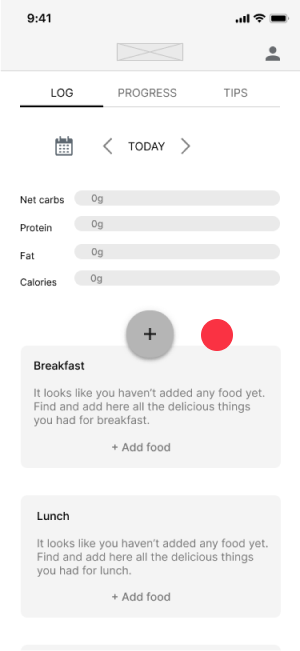
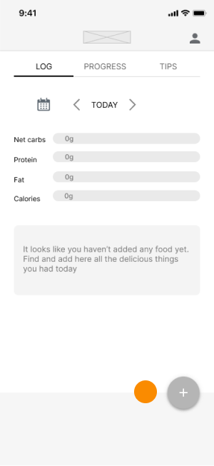
Pain point:
The users used only local CTAs to add food to meals. They did not understand the global + CTA initially. The presence of both types of CTA confused them.
Solution 1 - Almost there:
Keep it simple with one global + CTA. The meal type will be selected automatically based on time of day or in the following screen as a drop down.
Solution 2:
Do we even need the Global + CTA button? Consider removing it altogether and only keep the local Add Food CTAs.
After further testing on 11 participants, this solution was the winning one.
Iterate
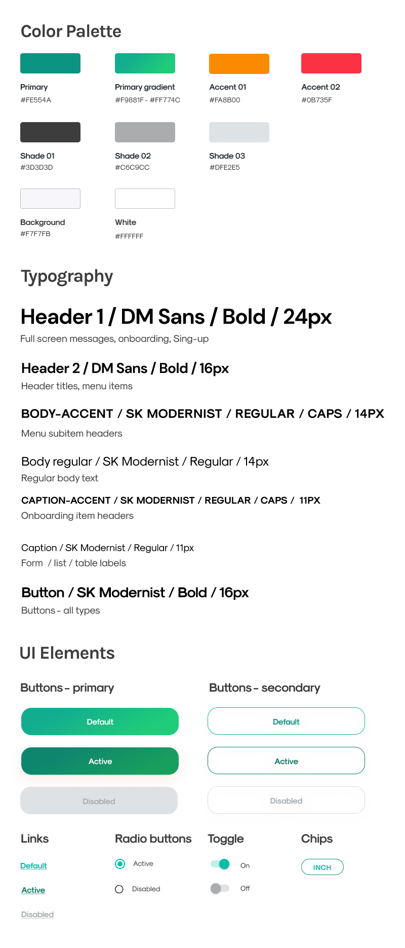
UI Styleguide
Whether working in a team or on many diverse projects at the same time, it is important to create a set of rules and components to ensure interface design consisency. Therefore, I created a styleguide that covers the most important visual elements of the CarbCutter design.
When making my visual design choices I focused on:
- Simplicity of design - negative space and limited numebr of colors,
- Associations with health and nutrition - invoked by the use of green hues,
- Accessibility of the design - making sure there is sufficient contrast between elements and clear messaging.
Prototype

Next steps
A Designer’s work is never fully complete. CarbCutter is constructed simply and utilizes a pattern for food logging that is familiar to existing users and easily discoverable for the future one
The next steps would include re-testing the usability of the app with with the realistic high-fidelity prototype.
Only when no further errors are apparent would I move on to add more functionalities based on the needs of each user persona.
What I learned from this project?
This project visualized to me the challenges of creating an entire product from scratch and how the original idea evolves as the work progresses. It reinforced the importance of focusing on the user every step of the way.
- I learned how to strategically prioritize work keeping in mind the big picture and realistic goals.
- I learned to let go of existing beliefs, rely on data, and try to identify the real isseus behind the problems.
- I learned to fail better. Sharing work early, seeking feedback often and constantly refining the design based on what works and what doesn’t is the most efficient way to achieve the set goals.